Is Bitcoin in trouble, potentially on the brink of collapsing to unexpected new lows? That’s the question on all crypto inventor’s minds, as the leading cryptocurrency by market cap tends to lead the bullish charge.
However, a somewhat forgotten style of technical analysis could provide the most cut and dry look at the current support levels – “important” support levels that are fully in tact despite the bloodbath to start December.Let’s Get Technical: The Origins Of Point & Figure Charting
and other computer software-based charting tools, technical analysis was entirely drawn by hand. Traders would wait for the bell to ring on the day before adding the daily close to their charts.More than a hundred years before Bitcoin was created, an anonymous writer by the name of “Hoyle” a different type of hand-drawn chart in 1898, called the Point & Figure chart. His writings were featured in the book The Game in Wall Street and How to Successfully Play It.
Related Reading | Finding Fibonacci: Is Bitcoin Beginning A “Golden” Recovery?
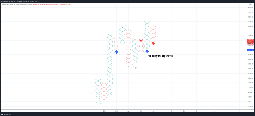
Point & Figure charts are a series of columns of Xs and Os. Unlike the the book’s title and the comparison to Tic-Tac-Toe, this type of chart is no “game.” It is designed to filter out time and noise from price charts, and make levels of support and resistance significantly easier to identify.
It also puts the focus on “important” price movements only. Which is why the chart might make the confusing situation in Bitcoin a lot more cut and dry.

Xs and Os make up a Point & Figure chart | Source:
Bitcoin Drops To Undeniable Support Level That Bulls Must Hold
The chart above might look unusual compared to the Japanese candlesticks and bar charts most traders share. Support can be drawn either at 90 degrees or at 45 degrees for an uptrend. Resistance also works similarly at 90 and 45 degrees.
Related Reading | Bitcoin “Speculative Chart” Suggests Cryptocurrency To Soon Blast off
Price is also now holding at the red line, which could be a retest of resistance turned support. An active buy signal still exists stemming from the most recent higher high of Xs, and a new sell signal won’t generate until two full circles below the blue line, creating a lower low.
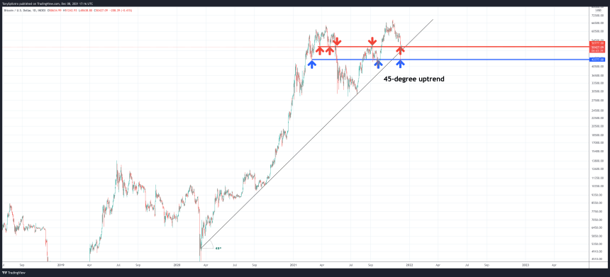
The same chart, but with candlesticks instead | Source:According to , “45 degree lines may be used to define up trends and down trends from important highs and lows on the chart allowing objective analysis of trends.” Switching back to the traditional candlestick chart that is normally shared here on NewsBTC, the same horizontal support levels and 45-degree uptrend line remain. Using the Point & Figure version is instantly more “objective,” eliminating any possible personal bias from the picture.
Related Reading | Bitcoin Falls Flat: Examining A Rare Bull Market Corrective Pattern
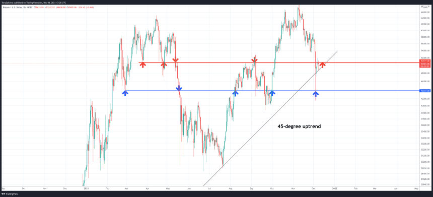
Zoomed in further below, the Point & Figure chart has potentially filtered out the wick to the low $40Ks, highlighted an “important” retest of the 45-degree uptrend line – which is currently holding – and could demonstrate a resistance to support flip in action.
Objectively, a decisive close of red circles below the red line and below the uptrend line would make it very clear that the bull phase is over, and more extended downside is coming.
Losing the 45-degree uptrend would be telling | Source://twitter.com/tonyspilotroBTC/status/07753482
Follow or join for exclusive daily market insights and technical analysis education. Please note: Content is educational and should not be considered investment advice.
Featured image from iStockPhoto, Charts from TradingView.com


